BEHIND THE BUILD / BRAND IDENTITY
From first
concepts to
TexMediator.
How Hugh’s early ideas became a finished identity and a connected website for his Texas mediation practice.
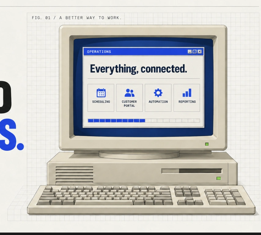
 A clearer identity.
A connected practice.BRAND IDENTITY / TEXMEDIATOR.COM
Every project starts somewhere. For TexMediator, Hugh Howerton brought several early logo concepts while we were planning the website for his Texas mediation practice. They explored Texas imagery, legal symbolism, and different color combinations. Those references gave us a concrete way to discuss the practice’s visual direction.
Renatus developed the finished logo and custom website as part of the same project. The progression below shows Hugh’s original concepts alongside the identity that became part of the practice’s online presence.
The ideas Hugh brought
Hugh sent two concepts on August 8, 2026, followed by a third option later that morning. The first used red, white, and blue; the second paired navy with gold; and the third explored gold on black. All three combined a Texas outline with scales and a handshake or figures reaching an agreement.
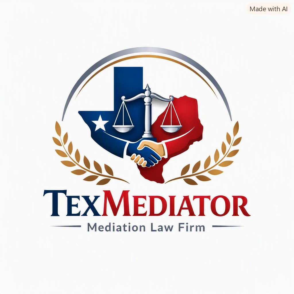
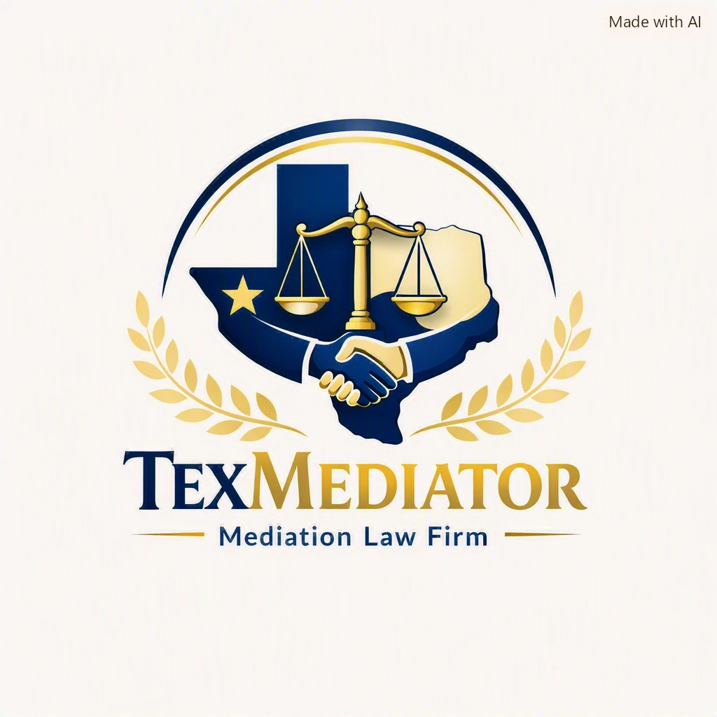

Original concepts supplied by Hugh Howerton. The images retain their original “Made with AI” labels. Select an image to view it at full size.
These concepts made the starting point visible: a Texas connection, a legal-services context, and an interest in gold as a prominent color. Sharing a few different directions also left room to develop a distinct final composition.
A more focused composition
The finished logo brings the design into a horizontal arrangement: a tower-and-scales symbol, the TexMediator name, and the P.L.L.C. designation. The Texas outline, handshake, and laurel branches from the earlier concepts give way to one compact symbol beside the lettering.
That change gives the practice’s name more space. Gold remains a visible connection to the initial concepts, while white lettering works with the website’s dark header. The serif lettering also sits comfortably alongside the site’s headings.
A logo needs to work where people encounter it. The horizontal arrangement fits the navigation header without requiring a large, square emblem. It also leaves room for the links and scheduling button that help visitors take their next step.
From logo to a working website
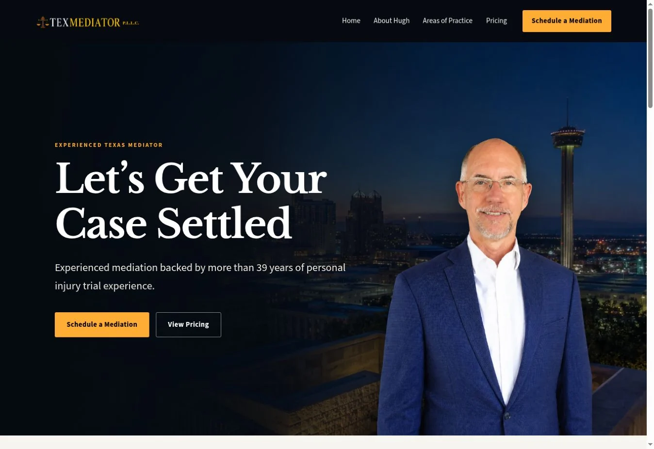
The website carries the identity through a dark background, gold accents, and prominent serif headings. The logo introduces the practice, while the surrounding content explains Hugh’s experience, mediation services, pricing, and how to schedule.
The branding also extends to client communications, including the logo in the footer of the Zoom details email. Together, the website and communications give clients a consistent way to recognize the practice as they move through booking and preparation.
The visual work was one part of a broader build connecting scheduling, case intake, payments, and Zoom. Read the full TexMediator case study for the systems behind that experience.
BUILD WITH RENATUS
Bring your starting point.
You can start with a few references, an early concept, or a business that needs a clearer online presence. We can discuss the visual direction and the practical website features your customers need, then agree on the scope together.
Talk about your projectExplore custom business websites or read more from the studio.