BEHIND THE BUILD / BRAND IDENTITY
Making the
name the
identity.
Why I recommended making the Zachry Insurance name the centerpiece of the brand, with typography doing the work of a separate symbol.
 The name comes first.ZACHRYINSURANCE.COM
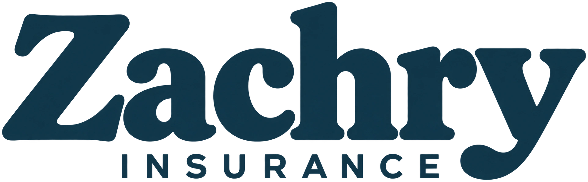
When we discussed the branding for Zachry Insurance, Clay wanted a logo. My recommendation was to make the company name itself the main visual identity. I wanted the lettering to give the business a recognizable presence and keep attention on the name people would look for when they returned.
That decision became part of the website’s design: a prominent Zachry wordmark, a restrained color palette, and a clear introduction to the person behind the business.
Start with what people need to recognize
The Zachry name already connects the company to Clay. I saw an opportunity to make that connection the foundation of the identity. Giving the name the most visual weight felt appropriate for a business where visitors are choosing someone to speak with about their insurance questions.
My goal was a professional, approachable presence. The website needed to introduce the business, explain its services, and make contacting Clay straightforward. A name-led identity could sit comfortably alongside all three.
Let the lettering carry the identity
This approach is often called a typographic identity. A business name styled to serve as its primary mark is a wordmark, which is a type of logo. The design choices live in the lettering, its proportions, the space around it, and how it appears across the website.
Here, “Zachry” has the strongest presence. The smaller, spaced “Insurance” line explains the business while keeping the surname prominent. Navy gives the lettering a clear contrast against the website’s warm, light background.
The current site also uses a small Z monogram as a supporting detail. The full company name remains the primary identity in the header. That distinction matters: the recommendation was to let the name lead the branding.
Build the website around the same idea
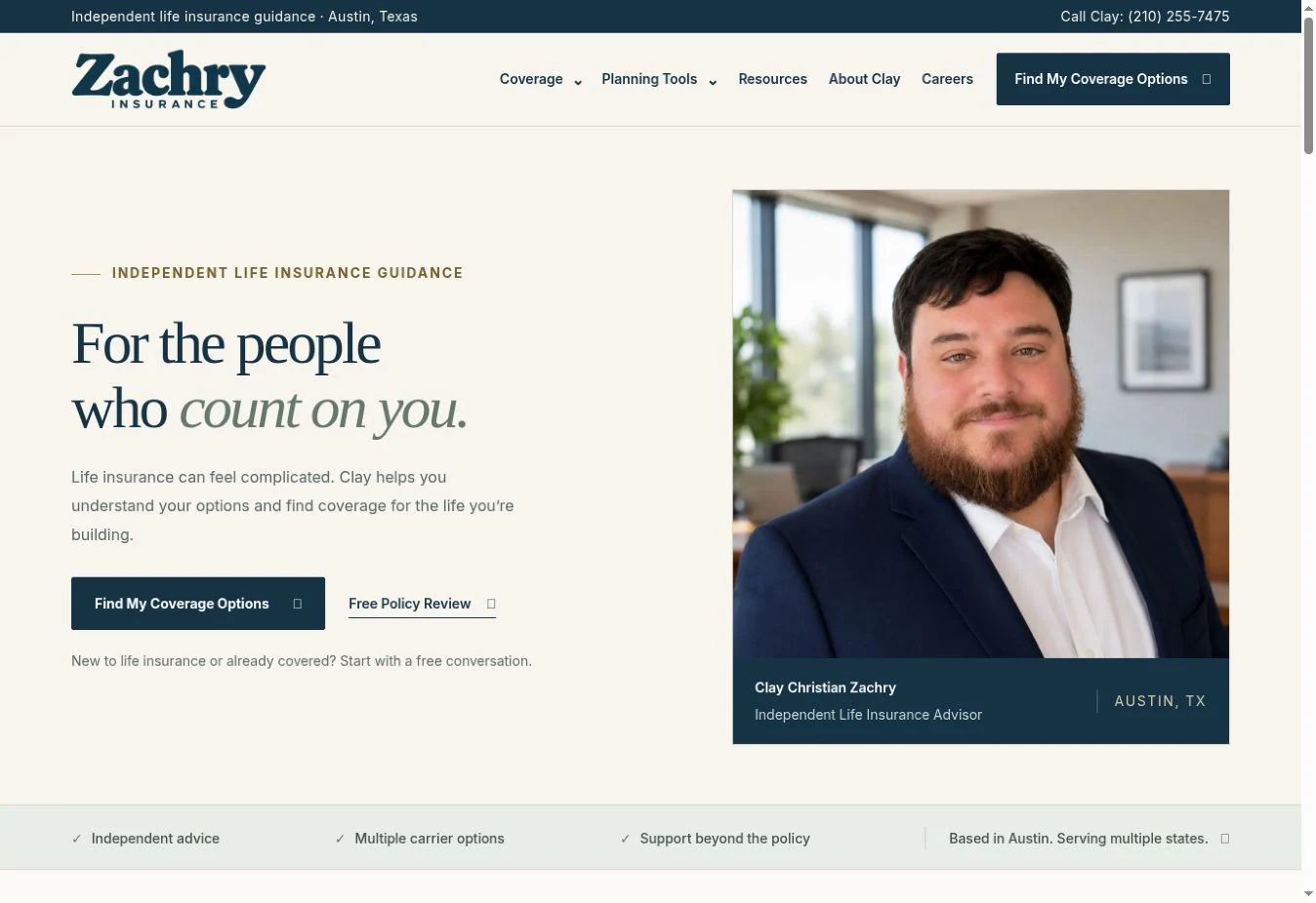
The header introduces the name. The opening section introduces Clay and the service. Serif headings, navy accents, generous spacing, and a direct path to a conversation carry the visual direction through the page.
Those elements work together as the brand experience. The wordmark has a specific role within it: identify the business clearly while leaving room for the content that helps a visitor decide what to do next.
The wider project includes educational pages, coverage tools, inquiry forms, and a separate recruiting path. The full Zachry Insurance case study covers that work and its search and measurement results.
Choose an identity that fits the business
For Zachry Insurance, I felt the name was the right place to concentrate the design. A distinctive wordmark gave the website a clear starting point, and the surrounding typography and layout carried that direction forward.
Another project can call for a different treatment. For TexMediator, the finished identity pairs the name with a tower-and-scales symbol. Each decision grew out of the business and the way its identity needed to appear on the website.
BUILD WITH RENATUS
Give your business a clear presence.
Have a name, an existing logo, or an early idea? We can work through how it should appear on your website and what your customers need from the experience.
Talk about your websiteExplore custom business websites or read more from the studio.